DFW
At a glance
Project timeline
2 week sprint, 2023
Project type
Theoretical
Client
Dallas Fort Worth International Airport
Tools
Figma, Google suite, Trello, Zoom, Slack, Photoshop
Team
Vickie C. - UX Designer
Michelle W. - UX Designer
The Project
At the DFW airport, throughput is the most critical operational function of the in-terminal checkpoint experience. It is in the airport’s financial interest to expedite passengers through security. The more efficiently passengers proceed through security, the more time they have to shop and dine.
In the post-pandemic period, however, passengers are required to go through a variety of health and security measures, which in turn shortens the time they have in commercial areas. They also have to deal with long lines, crowded restaurants and retail spaces, gate changes, and general navigational challenges typical of an airport.
For this project, my team and I needed to find a way to better the airport experience for these passengers.
Above
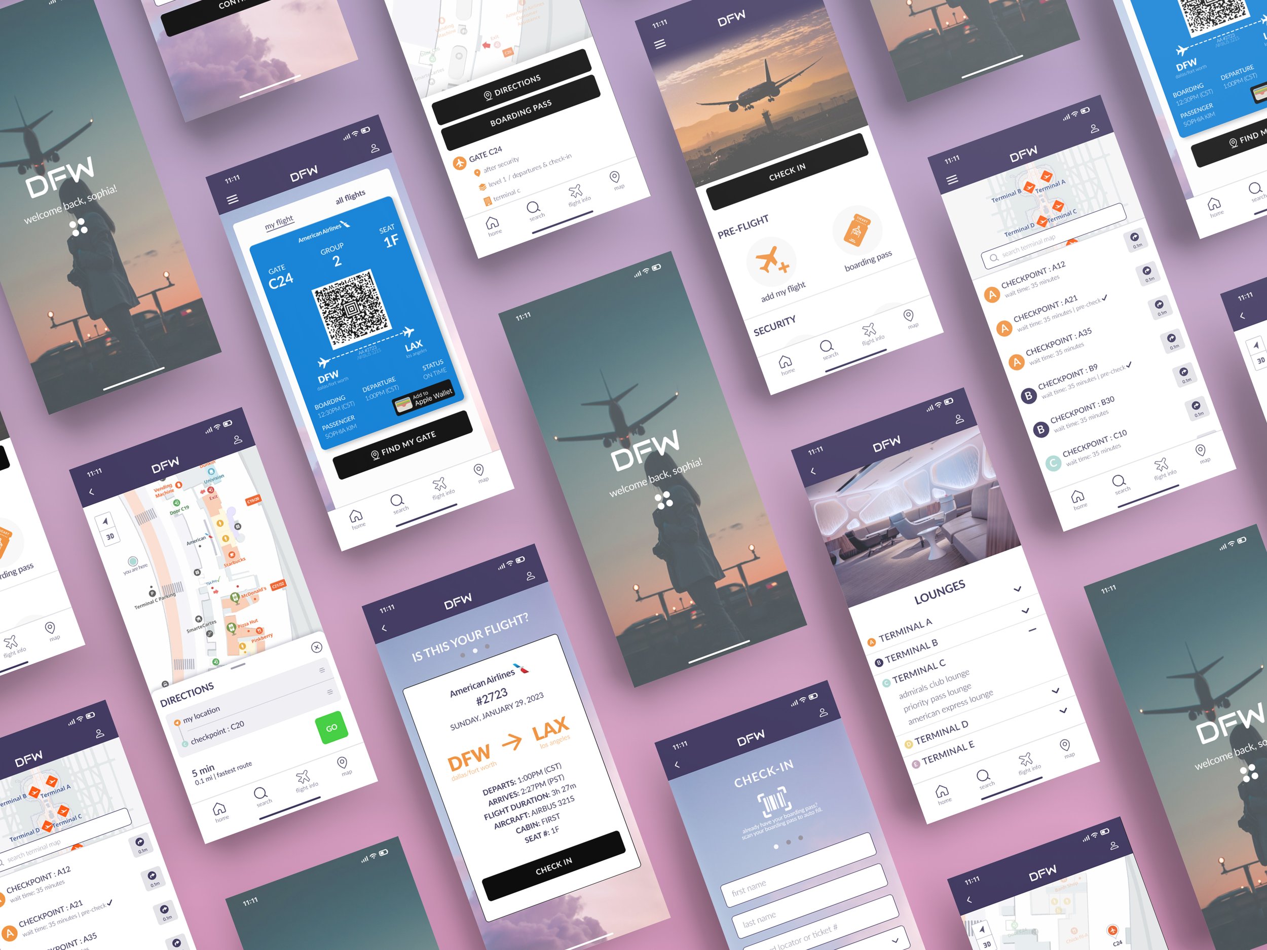
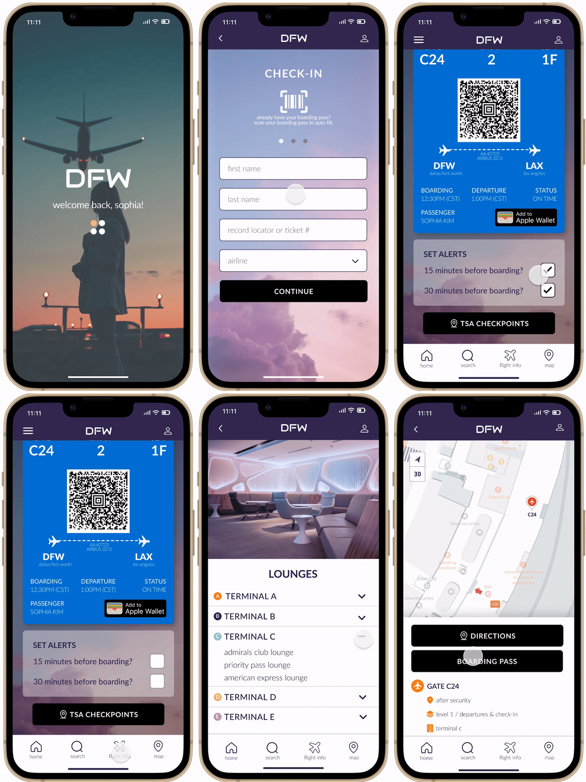
Final high fidelity prototype flow.
The problem
The business: DFW needs to streamline the in-terminal checkpoint experience and increase the time passengers have to shop and dine.
The user: Passengers need a way to increase their travel day efficiency and reduce points of friction.
The approach
Our first priority was to get to know our travelers, hear about their recent travel experiences and uncover any pain points that they had.
We conducted four user interviews with people within the DFW target audience and that had recent travel experiences. Here were our key takeaways…
Affinity mapping
“We had to figure out las minute problems on our own.”
“I’m always cutting it close, like 10-15 minutes to go.”
“I do like the automation of processes where I don’t have to talk to people.”
“Having an element that tells or shows you what to do next is so helpful in moving things along faster through security.”
“Navigating a new space under time constraints is stressful.”
Persona development
After our initial user interviews, I got a better idea about who our users were, their behaviors, goals and frustrations when it came to traveling. I developed a draft of our primary persona, and my team reviewed and made adjustments as needed. We would go on to use Sophia as a way to ground our decision making throughout the project.
Problem statement + HMW
After synthesizing the information we learned from the initial interviews and identifying our primary persona Sophia, I was able to start defining the problem Sophia experiences more clearly and the different ways we might be able to approach a solution. I proposed the problem and HMW to my team and we worked collaboratively to make adjustments and fine tune the final set.
Problem statement
Sophia needs a way to respond to the expected and unpredictable needs that may arise at the DFW airport because she will be traveling through DFW multiple times this coming year, she’s never been there before, and she wants to reduce the potential friction and make her travel day as efficient as possible.
So how might we…
reduce or eliminate the impact of unexpected delays at the DFW airport?
help Sophia know what to expect at every stage of the domestic throughput process at DFW?
make the time spent at DFW more efficient for Sophia?
User journey mapping
Even though we got great insights into the obstacles that travelers face, we wanted a way to contextualize Sophia’s experience traveling through DFW while using the existing app.
To do this, I combined what we already knew about our travelers goals, behaviors and frustrations with what we learned from a single initial state usability test that my team was able to conduct.
As you can see to the right, Sophia experiences some highs and lows and we were able to zero in on some key insights that we could use later during our ideation phase.
Insights
Search | users are quick to abandon searches if they present too much friction because they are time sensitive.
Navigation | some directions (within the app) are not the most efficient or accurate.
Current location search | There’s currently no way to search from your current location, user’s need to specify where they are.
Information architecture| There’s a lot of clicking into things to see status and other updates. It would be nice to have a way to glance at your flight number, access your ticket for boarding, set specific alerts, etc.
Opportunities
Proximity search | Adding a search with proximity filters could reduce time spent searching for correct choices.
TSA | TSA checkpoints vary even within the same airport. It would be helpful to know in advance what the checkpoint requirements will be.
Alert settings | Being able to set flight boarding alerts could help users who struggle with keeping track of time while at the airport.
What I learned: The user journey map was a really powerful way to visualize a task over time and isolate things that worked well within the existing app and other aspects which could use improvement. This information was also helpful in narrowing the focus of the competitive and comparative research my team conducted.
What I would do better: Given more time, I would conduct more initial state usability testing.
Information architecture
In our research we recognized a need to restructure the information within the landing page. Because this is such an important touch point for travelers and they are often in a time sensitive state, it needs to quickly allow them to find or navigate to the desired function or location.
Above
Proposed site map for the DFW app. Click image to enlarge.
Mid-fidelity prototype
Once we completed our initial research and improved the organization of the home page, my team outlined a proposed user flow. We used the insights from our research and started to explore possible solutions through sketching.
We eventually developed our mid-fidelity prototype in order to validate our proposed solution with people who represent our target audience.
Reflection
We introduced functions like checkin to our prototype. Given more time and access to the DFW development team, I think we would have realized that there are information access and privacy concerns related to the information needed to allow for in-app checkin.
Mid-fidelity usability test results
All participants were able to complete the usability tasks, however there were some areas of friction that needed to be addressed.
1
Travelers did not think the map on the terminal checkpoint page needed to be so big and would be more interested in seeing the map once the terminal checkpoint is selected.
“I don’t think the map is useful to me. I would rather see a large or complete list of terminals.””
2
Participants thought it would be more intuitive for the flight information icon to include updated flight information and their boarding pass/ other relevant information or links.
“I expected my boarding pass to be in the same place as the flight information. That’s what would feel intuitive to me.”
Recommendations
Map
Add functionality to the map.
Search bar
Add search bar that’s easier to locate.
Flight info
Consolidate flight information, boarding pass, and other related information.
Terminal search
Update the terminal search UI and functionality to feature a smaller map and a comprehensive list of terminal checkpoints.
High fidelity prototype
To validate the concept, my team and I collaborated with each other to build a high-fidelity prototype in Figma. This final prototype allowed us to once again work with travelers to understand what works and where they experience pain points in the final design.
Design
For the final prototype my team and I decided to give the app a refresh, however, we retained the DFW orange as an accent color because it is tied so deeply into the original brand.
Reflection
Given more time, I would have loved to develop a full style guide to document the style changes and to provide developers as a tool to refer back to as they are implementing the design.
High-fidelity usability test results
Now that we had a complete prototype in hand, we needed to test the changes we made with our travelers and analyze their feedback and results and make our final recommendations.
1
Travelers were able to navigate with minimal difficulty and completed all tasks successfully.
2
Most people found the icons on the home page easy to identify.
3
Some people did not realize they could click on the listed lounge options nested within terminal c lounges.
Recommendations
Terminal lounge page
Explore potential solutions to better indicate what text is clickable on the terminal lounge page.
UX writing
Refine ux writing on the check in page to be more intuitive when it comes to quick checkout in options, suck as QR code.
Reflection
Given more time I’d love to continue iterating on the design and conduct a few more usability tests. I would have also flushed out the style guide if our team had some more time.
Takeaways
One big lesson learned during this project, is that some features are not possible because of restrictions that the airlines have in place regarding flight information of their passengers. Given that this project was theoretical, I think we would have been able to establish that restriction early in the process during a stakeholder meeting.


