Nom Street
At a glance
Project timeline
3 week sprint, 2023
Project type
Client project
Client
Nom Street App
Tools
Figma, Google suite, Zoom, Slack, Photoshop, Lottie files
Team
Max M. - UX Designer
Eman C. - UX Designer
The Project
The founder of Nom Street approached our team with an idea to develop a tool that allowed people to find Halal-safe dining options wherever they are.
While a vendor facing end-to-end experience had already been developed, the Nom Street app was in need of a customer facing flow from sign-on to checkout.
Expectations and limitations were established in the first stakeholder meeting. We would need to examine the existing customer experience and develop and execute a plan for a complete end-to-end customer experience that could be handed off to engineering for development.
One limitation that was noted in the client meeting was that no customer service resource would be available at launch, so we needed to design for pickup only. Beyond that, visually, the client asked that we work within the existing brand colors and maintain the Nom Street logo as it was already live and representing the brand.
For this project, my team and I needed to understand and establish best practice for food locator applications and understand what pain points the audience faced when finding and ordering halal-safe food options.
Above
Final high fidelity prototype flow of the final Nom Street customer experience.
The problem
The client wants to increase access to Halal food vendors.
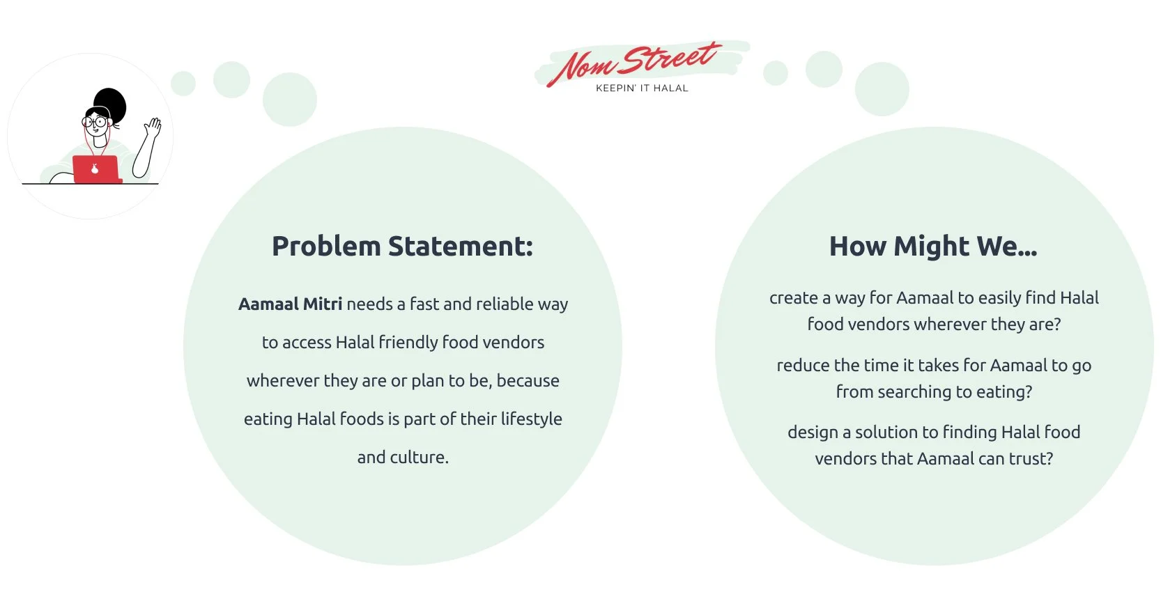
The customer needs a fast and reliable way to access Halal friendly food vendors wherever they are.
The approach
After meeting with our client and understanding the problem they were attempting to solve, the focus shift to understanding who would want to access halal food and what tools or methods were being used.
Of the initial user interviews, we distilled the following insights from our affinity mapping…
User Interview findings
Persona development
Our client connected us with people in their intended launch market which gave me an opportunity to understand and more deeply empathize with their goals and frustrations. I used these insights to form a persona that worked as a guiding principal to measure and drive our decisions.
Problem statement + HMW
With our user goals and frustrations defined, my team and I were identified a questions to explore in the next stages of our research.
The competition
One of our findings during the user interviews, was that the majority of users regularly utilized web or mobile tools to locate dining options. As a result, it was important to identify competitors in the online mobile food space and understand what features they each had.
Click to view full competitor and comparator feature analysis.
Insights
Viewing options | The option to view search results in list and map views was consistent across top performing applications.
Filter | Filtered search results allowed users to quickly narrow down their search results.
Categories | 4/5 comparators included search categories to help users broadly navigate popular options.
Opportunities
Information architecture | Applications that were popular with users utilized a well thought out hierarchy of information and navigation. Prioritization of the information architecture would to eliminate points of friction for the user and to drive more business to halal food vendors. Click to view full site map.
UI | Based on the apps most frequently used by the people interviewed, the assumption was that there were certain functions and design elements that were expected, projected credibility, and provided value to the user. I knew it would important to explore those elements in the design exploration.
What I learned: I observed an overlap of design elements in the most popular applications in our research. It would be important to explore those elements in my design exploration.
What I would do better: Given that we were tasked with creating an end-to-end experience for customers, I would have included a more in depth exploration and comparison of on boarding and checkout flows that I felt was lacking in the original feature analysis.
Proposed user flow
Prior to our sketching we explored the path a user would take to find and order food. This helped us ensure that the design of the product would be intuitive with the right information being presented at the right time and in as few steps as possible.
What I learned: One thing I learned was the sensitivity around asking for too much information too early in the user experience. In the end, the team, client and I decided on allowing the users to explore and even prepare an order before they create an account in order to not deter them from exploring local halal vendors and seeing the menus.
Sketching & Mid-Fidelity prototype
Sketch: As a team, we used the insights from our research to conduct a sketch exploration. We outlined a few goals for our exploration:
Map-toward: The map should be the primary food finding tool.
Navigation: How can we make navigation simple yet familiar?
Ease: All steps from searching to checkout should be easy for the user to navigate.
Options: how can we help users taper their search to their liking?
Intake: how can we motivate users to sign up?
Reflecting back…
Sketching was an opportunity to discover that we needed to break certain screens up over two separate steps and also consider quick pay screens for returning users. Given the time restriction, we moved quickly through this exploration, however with more time, I would continue to explore in the sketch phase a little longer and challenge our assumptions further.
Mid-fi prototype: We developed a mid-fidelity prototype based off our sketch exploration and conducted usability testing to uncover any areas of improvement for the final design and get direct audience feedback. The four following observations were noted.
1
20% of the participants thought clicking the plus icon would automatically add item to the cart right away.
“I thought the plus icon was there if it’s going straight to add.”
3
Participants mentioned that the order icon may not be the most recognizable.
“The only icon that I didn’t immediately recognize is the orders icon”
2
Participants mentioned that they liked being notified of the estimated wait time.
“I like that the app let me know how long the wait is going to be.”
4
20% of participants mentioned that the search could be simplified.
“the search part felt a little bit weird, that in between screen was the only scene that threw me off.”
Recommendations
Based on the user feedback, I met with our client to discuss our findings and the final recommendations for the high fidelity prototype.
High fidelity prototype
My team and I collaborated to create the high-fidelity prototype to the left. We utilized this prototype to conduct another round of usability testing both validate the changes recommended from our previous round of testing and surface a final round of recommendations for our client as they take the design into the next phase of development.
Design
At the onset of the project our client asked that we maintain the brand colors and logo while giving Nom Street a contemporary look and feel. In addition, I utilized Lottie animation to include animations to enhance the user experience by adding immediate feedback and create a more enjoyable browsing and ordering experience.
High-fidelity usability test results
Thanks to my team and our client, we were able to get a final robust round of usability testing. The resulting findings below helped me generate final recommendations to our client for the handoff.
1
44% of users mentioned that they experienced a sense of familiarity to other food apps.
“The app looks and feels familiar and zesty to navigate.”
2
67% of users reported experiencing confusion with the search functionality.
“Having current location was confusing especially paired with the search icon.”
3
Some people noted they would want to be able to add to or edit their previous orders.
4
People felt confused by the reorder cat and weren’t sure what would happen if they pressed it.
“I’m hesitant to hit reorder because I’m not sure if I’m ordering from the same order as before or just reordering from the restaurant.”
Final recommendations
Knowing that our client would be first performing an initial launch and would need to continue to make updates in the future, we broke down our recommendations into short and long term considerations.
Immediate recommendations
Search bar language | the language and icon combination used in the default search bar may need to be considered further for clarity and immediate recognition.
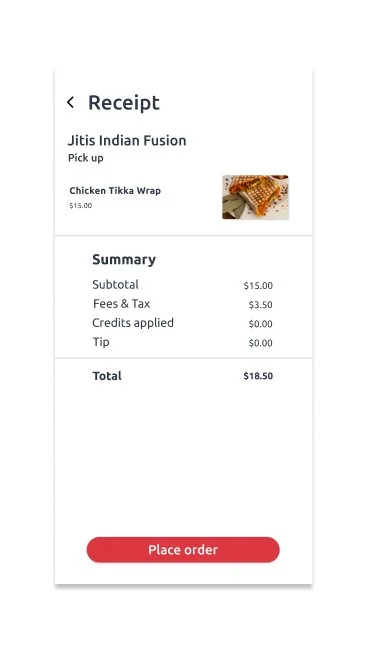
Previous order receipt features | further exploration on how to present past orders should be considered with a focus on faster identification of past order items.
Long term considerations
Map behavior
Multiple language support
Reminder or order tracking function
Delivery option
The hand off
Part of our scope of work was to provide our client with a final prototype in Figma. In addition, I put together a style guide of the app design to help our client maintain a level of consistency even as the app evolves and grows.
Reflection
I’m proud of my team and I for working hard to deliver on the expectations outlined with our client. There’s always room to improve and given more time, I’d love to continue to iterate and improve the end-to-end user experience for the Nom Street application.
Takeaways
This project was a unique experience because I had to consider not only the needs of the user, but the larger needs of my client and the market they wish to enter. Leading a team of UX designers in the research and design of an end-to-end product taught me to manage the expectations of my client and my team early and often so we could meet our goals and leave our client with a producible outcome.


