Amoeba Music
At a glance
Project timeline
2 week sprint, 2023
Project type
Theoretical
Client
Amoeba Music
Tools
Figma, Google suite, Trello, Zoom, Slack, Photoshop, Illustrator
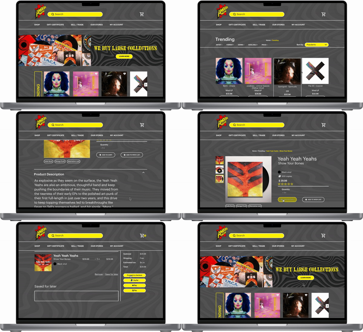
Above
Final high fidelity prototype flow.
The Project
Amoeba music is a California based music shop with locations in Berkley, San Francisco and Hollywood. Although the stores are the heart and soul of this shop, Amoeba also has an e-commerce site with thousands of products.
For this speculative project, I was tasked with exploring the intersection of user and business needs for Amoeba’s e-commerce desktop experience. The final result would be a re-design of a single flow, from product search to checkout.
The problem
The business: Amoeba wants to provide users with a positive online shopping experience. Through their research, they realized users were struggling to discover new music and wanted an easy way to search and verify details of the products they were purchasing.
The user: Users were looking for a variety of ways to discover music online and also expressed how they wanted more information on analogue music products to determine if they would buy it.
My approach
My first priority was to understand how users were interacting with the original desktop website and find out if the experience is measuring up to their expectations.
At the same time, I wanted to understand how users have purchased analogue music before and what they expect out of that online shopping experience.
To that end, I conducted three user interviews and a round of usability testing on the original site. Here were my key takeaways…
“If I know exactly what I’m looking for, I’ll use the search bar.”
“I would normally inspect an album and the cover for any damage, so visually inspecting a product is important.”
“Featured music sections would be helpful so I don’t have to browse too long and so I can get ideas.”
Usability test results
3/3
Users wanted to see categories of music on the home page and a general implication of viewable content.
“I would be interested in what people are buying right now rather.”
2/3
Users wanted to be able to scan for specific songs without having to click into each product listed.
“I can’t see what’s in each album.”
3/3
Users utilized the search bar to find the album.
“There’s a lot going on visually, so I was glad there was a search bar to use.”
2/3
Users noted that the search bar could be more prominent.
“I wish the search bar were bigger.”
Recommendations
Layout & best practices
My research indicates that elements like cart and add to cart cat, were less intuitive than needed and could be refined.
Organization
There is an opportunity to create categories that help users get shopping faster.
Checkout
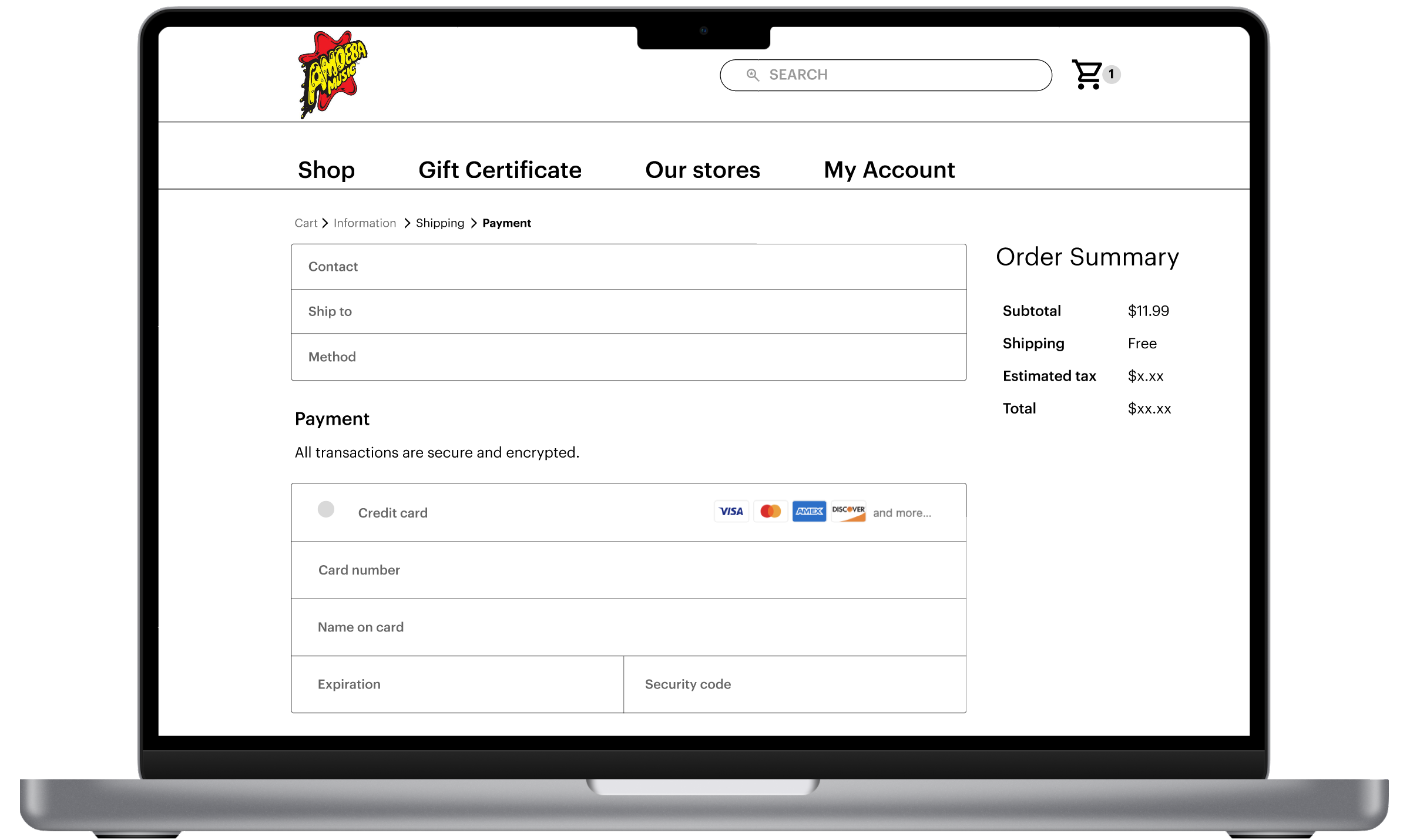
Users want to see a variety of checkout options that expedite their experience.
Search bar
Update the search bar to sit more prominently at the top of the page to make it easier for users with little to no time to move through the process faster.
Persona development
After my initial user interviews, I developed a persona to refer back to throughout the project. Pablo helped me ground my decision making in their goals and frustrations.
I developed a current state customer journey map with the synthesized findings from the user interviews. Identifying the key wins and pain points in the user’s journey was essential for helping me narrow the focus of my visual exploration.
Insights
Music categories | users want to see curated music categories or genres groupings.
Search options | users that know what they’re looking for will almost always opt for the search bar.
Product descriptions | Users feel that comprehensive product details makes it feel safe to buy.
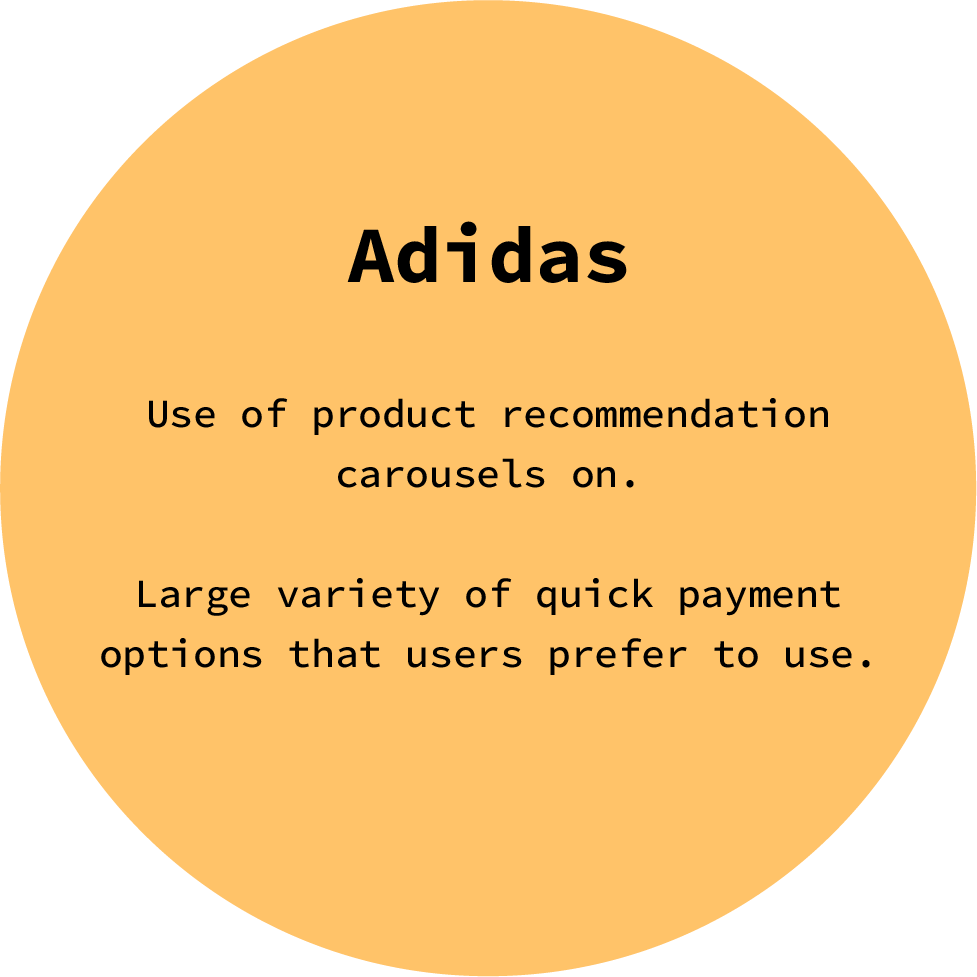
Quick pay | Users would like faster payment options.
Opportunities
Information architecture | Simplify the home page to get users browsing faster.
Product categories | Incorporate curated categories / genres of music earlier in the experience.
Product detail page | Rework and add information on the product pages to provide a clearer idea as to the condition of the product.
Problem statement + HMW
After synthesizing my initial research, I identified the users specific problem.
Problem statement
Pablo needs a simplified yet engaging way to discover new music and verify its condition because he wants to reduce the time spent searching for analogue music products.
So how might we…
increase discoverability of new music?
make a vast product catalog easier to navigate through?
help users eliminate any surprises around the condition of the products they purchase?
Pulling inspiration
Now that I had the problem statement defined, I wanted to understand how Amoeba’s direct competitors and indirect comparators were solving the same problems my users were experiencing.
Below
Direct competitors to Amoeba Music’s website. See feature analysis.
Below
Indirect comparators with desirable UX patterns. See plus & delta chart.
Information architecture
It became clear that to reduce the clutter of the original home page and make it easier for users to discover new music, I would need to reconsider the information architecture of the HP.
For the proposed site map, I did an audit of the viewable content on the home page and determined what items could live as subcategories to the main categories in the global menu. This created more space for music genres to help users discover new music faster.
Above
Proposed site map for Amoeba.com
Ideation
After all the research synthesis, I was ready to an exploration through sketch and eventually develop my mid-fidelity wireframes.
Challenges
It was a challenge to layout a large variety of content in an efficient way. Ultimately the orientation of filters would change to leave more room for inventory to lay out on the pages. The C&C analysis was really helpful to refer back to at this stage.
Reflection
Given more time, I would have liked to explore a bit more in this phase before moving on to mid-fi prototyping.
Mid-fidelity prototype
The mid-fidelity prototype was an opportunity to tighten up the design further and to conduct the next round of usability testing.
Observation
When I conducted this round of usability testing, I noticed that some of the text felt a little too large. I would go on to address this issue in the high-fidelity prototype.
Mid-fidelity usability test results
All participants were able to complete the usability tasks with no errors and under the time expectancy.
Reflection
Although I gleaned some great insights, I feel I could have written the questions or designed the prototype to allow for a larger variety of search options instead of users depending so much on the search bar to accomplish their tasks.
1/3
Users had eventually found the search bar, but didn’t spot it at first because it was not differentiated enough.
“I think the search bar should look a little different, right now it looks like everything else.”
3/3
Users preferred using the search bar to find what they were looking for because they already had an idea of what they wanted.
“I would use the search bar if I know exactly what I want.”
3/3
Strongly preferred using PayPal or Apple Pay to traditional checkout flows because of security & efficiency.
“I like how express pay options show up twice.”
Next steps
Search Bar
Distinguish the search bar from the surrounding UI to make it easier to spot.
Categories
Create and display more prominently a popular category of product for users who wish to discover new trending music.
High fidelity prototype
To validate the concept, I prepared an interactive prototype in Figma. Due to the limited time constraint for this sprint, I focused on preparing a single flow with multiple tasks.
Design
For the design of the final prototype I decided to work within the established design system. I updated the use of that system to give a refreshed and modern feel that is comparable to some of their competitors like Tower Records.
Reflection
While I acknowledge the parts of this project that were successful in addressing the problem users encountered with the original site, I was not able to run an additional usability test on the high fidelity prototype. With more time, I would conduct another round of usability testing and explore the need for a mobile version of the Amoeba app.


